Sunday, 19 January 2014

Chatsworth House & Modern Makers


Chatsworth, one of England's greatest country estate's, opened up its grand State rooms as inspiration to sixteen leading international artists for a contemporary take on its historic surroundings.

The Duke of Devonshire said: "Historically the internal decoration at Chatsworth was brought up-to-date by every successive generation, invariably with objects made by the best contemporary makers. I think it's entirely fitting that a new generation of modern masters should take inspiration from the best of the past to create these wonderful new works."

For me the Modern Makers exhibition was incredibly inspiring, and sparked real excitement about the prospects of exploring the language between contemporary craftsmanship and historic place. The exhibition aimed "to challenge perceptions about the role of contemporary crafts in historic settings by using Chatsworth's five State Rooms as inspiration. "

I was particularly drawn to the work of Ptolemy Mann who describes her exhibition as "more of an experience, something you move through, than a traditional installation that you view. Each panel embodies a certain colour that I found in the house itself and is a deep exploration of what I call Chromatic Minimalism" 
chromotagenous


Ptolemy talks more in depth about the how Chatsworth house inspired this exhibition in a short essay posted onto her blog Significant Colour. Below is a visual record of my journey as I walked through the house, including photographs from the Modern Makers Exhibition.

Photographs taken at Chatsworth House : Eclectic Decor

Chatsworth House : Eclectic Decor 


Monday, 13 January 2014

Curating themes 17 October 2013


AGEING POPULATION - INCLUSIVE DESIGN - 3D PRINTING

An initial group research project was set working within the top 100 trends outlined by BMW Guggenhein Lab. Split in to assigned groups, we were to choose 3 trends form the above link, which is no easy task when working with such a diverse range of personal interests. However a conclusion was reached that meant that everybody had at least one trend that they were passionate about.

We were a mixture of full and part time students,  which made face to face contact with the whole group impossible until the day of the presentation. Consequently we used social media as the main tool for sharing and linking our findings.

As a group our skill base covered Animation, Graphics, Textiles and Product Design and as a result we responded to the task by creating a clear info graphics poster (see below), a short amalgamated film, and a concept for a product that encompassed all 3 of our chosen trends.

No solid conclusions were drawn from the research, however by undertaking the project we learnt the usefulness of using social media as a tool for sharing information and also the benefits of working with designers from other disciplines and how this can enrich both the learning experience and the outcomes of such projects.

This was also apparent in the other groups presentations. The final presentations gave us an inspiring insight into many of the other urban trends, and consequently helped to broaden everybody's awareness and understanding of a range of themes that would not have been possible to achieve within the small groups alone.


Poster Design for our group presentation


Saturday, 11 January 2014

Poster Presentation - 10 Oct 2013

A3 Poster Design
 A poster showing my most recent works presented to peers on the MA Design course.

Watchword technique

The watchword technique works as a reverse mind map. I was introduced to the technique in the beginning weeks of the Design MA at Manchester School of Art. We used it as a way to determine our individual design practice and interests. The beauty of the process is that from the outset you can never be sure of the final outcome. Ultimately the reversed map becomes a useful resource for self reflection and understanding. 

Watchword technique Oct 2013

Watchword technique Jan 2014

After an initial period of research, exploration and experimentation I was intrigued to repeat the watchword technique to see if / how my design intentions had evolved. You can see the comparison above. The aim over the next few weeks is to reflect on the journey so far, from "home" to "vehicle".

Sunday, 13 October 2013

British Ceramics Biennial 2013


The British Ceramics Biennial is back for the third year running and is well worth a visit. The festival presents work from the UK's leading contemporary ceramic artist and takes place at the original Spode factory site in Stoke town. This is a truly experiential exhibition uniting both the work on display with the building that houses it.

An interesting contrast can be found between the FRESH exhibition which showcases the works of recent UK ceramic graduates and the environment in which they are displayed. Spode, once one of the two largest potteries in Staffordshire and now a decaying and dis functional shell, now lends itself as a great exhibition hall, rich with historical context and highly functional exhibition furniture which provides a platform for a new era of ceramics to begin and hopefully a wider appreciation of British ceramics.


Helping Hands 

I was fortunate enough to get involved with the final installation of Kate Lynch's 'Helping Hands' project. During the first weekend of the exhibition, Kate invited visitors to leave their mark by placing a 'Helping Hand' on any of the three walls situated between the pavilions in the China Hall. The 'Helping Hands' are carrying out ceramic-based activities to repair the walls and suggest the collective rebuilding and repairing of an industry. 

Below are examples of areas that visitors highlighted to be in need or repair:


I believe what makes this project so successful is it's simplicity, it's interactivity, and it's strong illustrative style. Kate's work instantly connects the viewer with the building thus encouraging the viewer to open there eyes and to look beyond the exhibition. It was Kate's intention to get "people looking at the walls and considering the future of the factory and the industry".

The following images show the Installation of the 'life size' ceramic hands undertaking their repair work:


To visit Kate's blog, see the link below:


As a reminder that Helping Hands can help repair any patch of our lives in need of a little TLC, these porcelain pin badges are available to buy in the Spode shop and make great little ceramic souvenirs.


Be a part of it, and visit Spode!


Tuesday, 1 October 2013

Grayson Perry - The Vanity of Small Differences


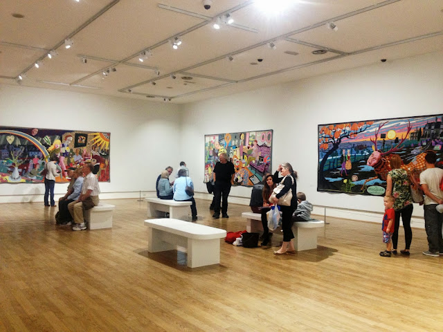
I was fortunate enough to see Grayson Perry's latest exhibition - The Vanity of Small Differences - at the Sunderland Museum and Winter Gardens. If you didn't see the three channel 4 Series In the Best Possible Taste  -then I urge you to do so! Only having followed the Journey of Perry's research do you truly appreciate the final six tapestries that make up the Exhibition. 

During the series, Grayson Perry goes on a safari amongst the taste tribes of Britain, to gather inspiration for his artworks, literally weaving the characters he meets into a narrative partly inspired by Hogarth's A Rake's Progress.

In Episode one of the series, Perry begins his investigation in Sunderland, a city with strong working class traditions. In Episode two he embeds himself with the british middle classes in and around Tunbridge Wells and lastly, the series ends with Perry's final journey in the exploration of British 'taste' by living amongst the upper classes of the Cotswolds in Gloucestershire.

You can watch this Series by clicking on the Link Below.


 Grayson Perry comments -

"The tapestries tell the story of class mobility, for I think nothing has as strong an influence on our aesthetic taste as the social class in which we grow up. I am interested in the politics of consumerism and the history of popular design but for this project I focus on the emotional investment we make in the things we choose to live with, wear, eat, read or drive. Class and taste run deep in our character - we care. This emotional charge is what draws me to a subject".


An interesting aspect of the exhibition for me was watching how people viewed the tapestries within the space. As the Tapestries told a story, people circulated the space in a clock wise motion, following the transition of time from one class to the next. In effect it was like reading a giant six page picture book, with each chapter illustrated intricately on one page accompanied by small snippets of text.

Each tapestry was so rich with content, that I found my self dissecting them into smaller, more digestible sections ... once dissected, they still remain packed with significant references to the wider picture.


It was great to view this exhibition in Sunderland, as it felt like the project had come full circle from the first episode in the TV series where Perry started his 'taste tribe' research. 

I have just been made aware of the App for i-phones and i-pads, which gives an insightful audio tour of the tapestries. What a fantastic tool! For more information, see the link below:


Sunday, 29 September 2013

London Design Festival 2013


Today I'd like to share with you my favourite bits from my trip to London Design Festival 2013. If you like what you see, please visit the websites attached to find out more about the designers / companies and their products. I have certainly found it very Inspiring!

Materials Council
http://www.materialscouncil.com/

Ruskasa
www.ruskasa.com

Lex Pott
http://www.lexpott.nl/

Derek Wilson
http://www.derekwilsonceramics.com/

Obe & Co Design
http://www.obeandcodesign.co.uk/


Tortus Copenhagen
http://www.tortus-copenhagen.com/


Laura Slater
http://www.lauraslater.co.uk/


Didn't catch the label 


It was really nice talking to Joyce Bates, the creator of these beautiful contemporary knit products. Joyce designs and makes all of her products from her studio in Nottingham, together with the help of a small family run factory in the Midlands. It is really inspiring to talk to sole designer/makers who have successfully built up their own labels 'locally', keeping the manufacture of their products within the UK. As you can see in this display, Joyce's products confidently sport their individual patterns and are united by their simple graphic styles and their bold, complimentary colour palettes.Joyce certainly has an eye for pattern and composition, and this clearly filters through to the display stand. Seven Gauge Studios made such a warm and inviting atmosphere, that I could have happily plonked myself there all day!